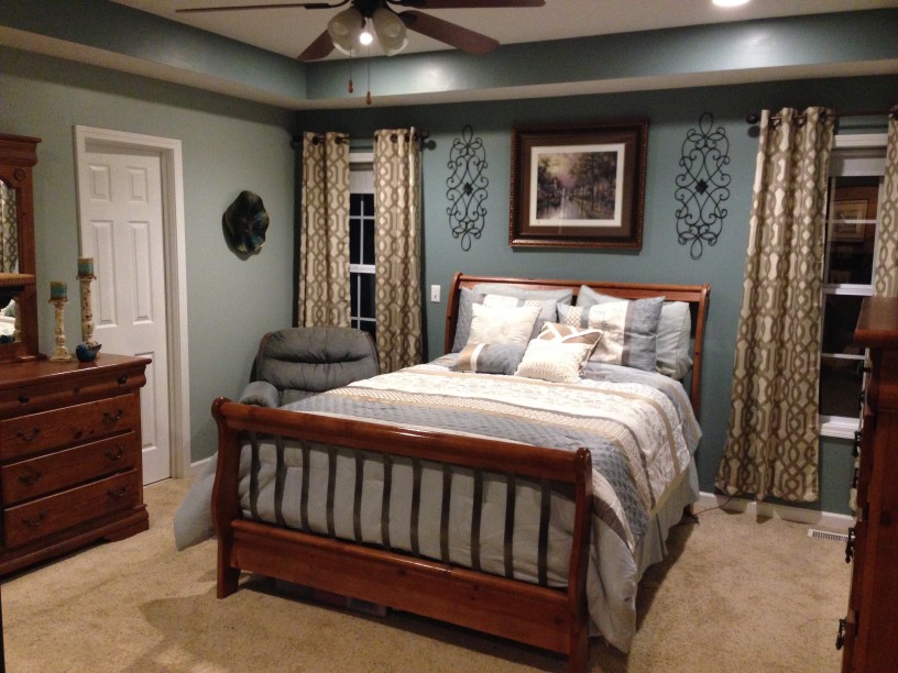
The Benjamin Moore Colour of 2021

The global pandemic has resulted in many of us being at home full time. We’re indoors with our partners, pets and children. Our homes have become an office, a classroom and a workout space. They are the center of our daily lives. Why not make our dwelling as comfortable as possible; create a space that is warm, nourishes our spirit, contributes to our wellbeing, relaxes and recharges us. The colours we surround ourselves with have a powerful impact on our emotions and our sense of wellbeing. It is with this in mind, that Benjamin Moore has chosen Aegean Teal 2136-40 and a corresponding colour palette as the colours of 2021. These colours celebrate the connections and real moments that take place within our homes and help make our space a haven, a place to weather the storm.
How is the Benjamin Moore colour of the year chosen?
The 2021 colour and palette are the result of a yearlong exploration of design, art, fashion, culture and environmental influences from around the globe. They are selected from Benjamin Moore’s library of 3,500 hues. The result is a thoughtfully curated colour palette and one standout colour of the year.
The colour of 2021:
Aegean Teal 2136-40 is an intriguing blue-green that creates harmony, invites reflection and imparts a sense of serenity. It’s soothing and uplifting. Use it on a feature wall in the living room or family room. Try it on kitchen cabinets or the front door. Paint it on furniture or a bookcase for a welcome burst of colour. Pair it with the following colours from the complementary palette.
The complementary colour palette:
Gray Cashmere 2138-60 is a stunning light green with a blue-gray undertone that works well in bedrooms.
Atrium White OC-145 is a pale, gray, cosmetic white with a sandy undertone and is perfect for interior trim. Sophisticated and versatile, it offers subtle nuances of white that are tranquil and serene.
Muslin OC-12 is a trending neutral colour for areas where you want a warm, soft, off-white shade.
Foggy Morning 2106-70 is an elegant nude with a hint of pink. Pair it with violet, stone gray, or a dusty, vintage brown. It’s a perfect backdrop for bold, multicoloured artwork or bohemian decor.
Amazon Soil 2115-30: A hint of black gives this pronounced shade of deepest mauve its rich, velvety quality. Dramatically dark, it inspires a sense of tranquillity.
Silhouette AF-655 is great for rooms with high ceilings or skylights as they balance its dark bold hue.
Kingsport Gray HC-86 is slightly more brown than gray. It’s the favoured warm neutral of the year and does wonders for your walls, creating a warm cozy alternative to standard gray. It offers a casual elegance and pairs well with a wide range of light, bright hues.
Beacon Hill Damask HC-2 is cheery! This light yellow shade is equally at home in a kitchen, bathroom, bedroom, or living space, bringing a splash of optimism. Barely-there gray undertones give it just enough weight for a more formal setting.
Chestertown Buff HC-9 is an earthy, gently muted maize that works beautifully in both contemporary and classic settings.
Potters Clay CC-360 is a timeless, elegant, usable colour. A mid-tone, gray, clay beige with a khaki undertone, it’s a perfect colour for contemporary living spaces. Pair it with tones of rust and navy-inspired accents.
Rosy Peach 2089-20 is on the red side of coral, a punchy and vibrant colour yet soft enough not to dominate. Pair it with a greenish charcoal gray or even a muddy purple hue for a striking first impression. Try it on kitchen cabinets!
How to use the collection:
The best way to incorporate trending paint colours into your interior design is to decide which architectural features or decor pieces that you want to highlight and choose a paint colour that makes that feature pop. Remember to balance natural light, space, and openness against dark or bold hues.
Swap out cold, industrial grays and sterile whites for sunbaked hues and inviting tones that breathe new life into your favourite interior and exterior features. Refresh your cabinetry, repaint the front door or create a cozy reading nook. Make the home you are spending so much time in a vibrant and colourful dwelling. Breathe new life into your space with a vibrant shade from the Benjamin Moore Colour Trends 2021 palette.
Interested in Benjamin Moore’s 2021 colour palette? Want to make your home a warm and inviting space? Call Calgary’s independent paint and blinds store West Hillhurst Paint + Design at (403) 270-9696 or email at [email protected]. Our knowledgeable professional design associates provide high-quality paint and stain, a wide selection of blinds, advice for home projects and excellent service. We carry Benjamin Moore products. Call for a consultation today!
MORE INFORMATION
TERMS & CONDITIONS
PRIVACY POLICY
PLEASE NOTE
On-screen and printer colour representations may vary from actual paint colours
COPYRIGHT
© 2020 Benjamin Moore & Co.
All rights reserved


